How to Choose the Right Art Style
The art style is the first thing a reader notices and the hardest thing to change your mind about later. It sets the look of every illustration and every character in the book, so it is worth a minute of thought before you start writing.
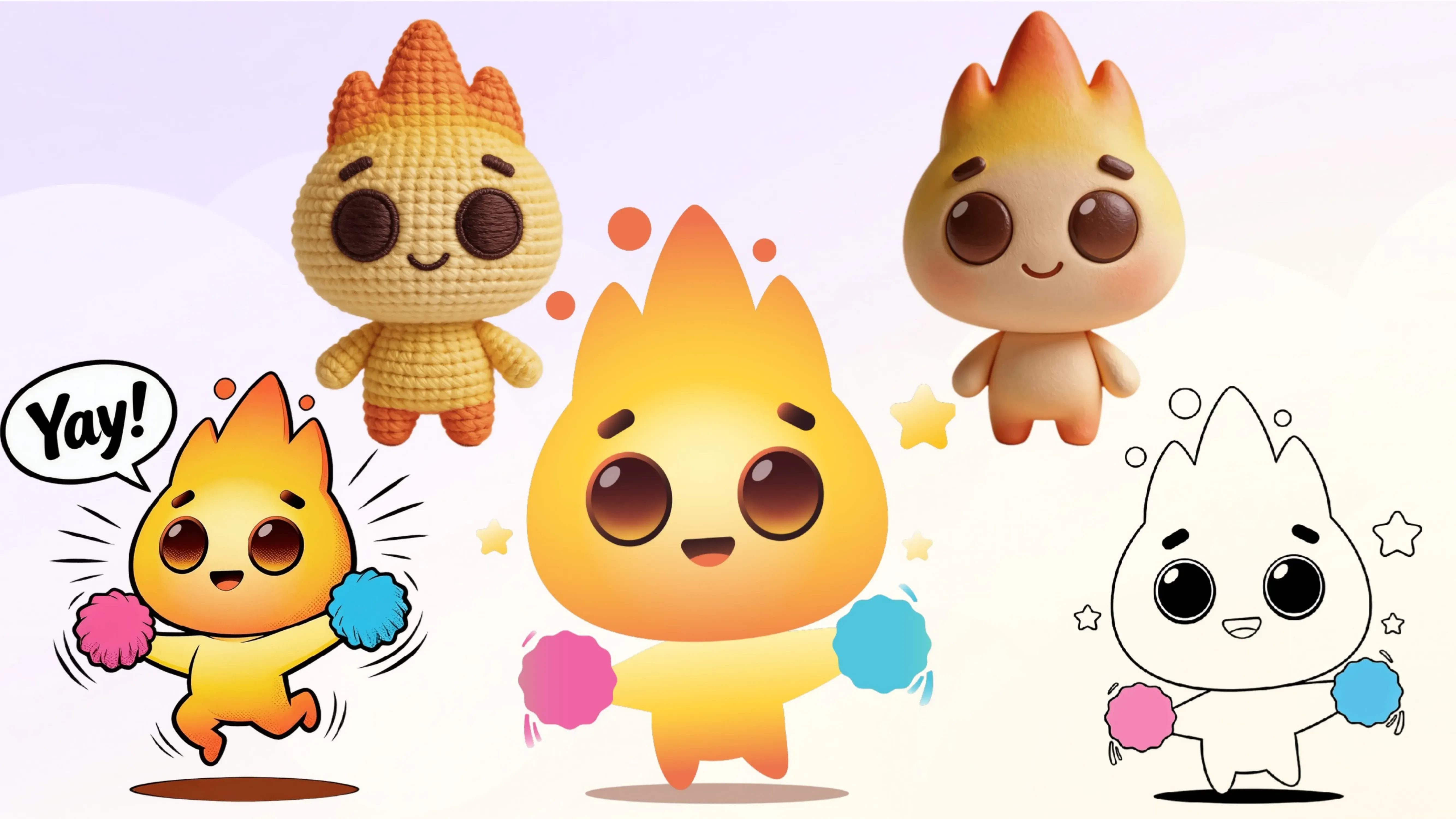
What this choice actually does
You pick an illustration style in the Book details step when you create a book. That one choice applies to the whole book: every illustration you generate afterwards, and every character, is drawn in it. It is what makes a finished book look like one book rather than a folder of unrelated pictures.
It also ties directly to your cast. A character generated in one style and placed on a page drawn in another reads as a mistake, even to someone who could not say what is wrong. Settle the style first, then build your characters in it.
Can you change it later?
Not in one move. There is no button that re-renders a finished book in a different style.
What you can do is regenerate illustrations one at a time: use the existing picture as a Reference, choose a different style, and the new version comes back in that style. That is fine for a page or two. For a twenty-page book it is twenty regenerations, and your characters have to be carried across as well.
So treat the style as a decision you make once, at the start, rather than something to revisit halfway through.
Let the Recommended badge do the first pass
Some styles in the picker carry a Recommended badge. It is not a fixed shortlist of house favourites — AnyTale works it out from what you have already told it about the book: the age group first of all, then the direction of the story (adventure, fantasy and so on) and its overall mood.
That has a practical consequence. Fill in the age group and the story before you linger over the style tiles, and the badges will already be filtered for your book. If you are torn, a badged style is the safe pick — it has been matched to your reader's age, not to someone's personal taste.
The full set, by family
There are 28 styles. They fall into a handful of families, which makes the list much easier to navigate.
| Family | Styles |
|---|---|
| Classic picture book | Storybook, Artbook, Magic Tales, Pastel book, Comfort art |
| Painted and hand-drawn | Watercolor, Oil Pastel, Painterly Touch, Hand painting, Pencils Art, Wax pencils |
| Cartoon and graphic | Playful Cartoon, Modern Graphic, Vector art, Retro lines, Retro Print, Stickers |
| Anime | Cute Anime, Anime, Fantasy Anime, Dreamy animation |
| 3D and handmade | Clay Characters, Magic clay, Knit 3D, 3D Clean |
| Atmospheric | Cosmic Dreams, Sunset art |
| Line art only | Coloring pages |
Choosing by the child's age
Age is the strongest signal, and it is the first thing the badge weighs. Here is the reasoning behind it, which also helps when you are judging the styles that carry no badge.
| Age | What works, and why |
|---|---|
| 1–3 years | Big shapes, bold colour, few details. Try Playful Cartoon, Stickers, Vector art or Clay Characters. Very young children read faces and silhouettes, not texture. |
| 4–6 years | Warm and friendly, with a bit more scenery to look at. Storybook, Cute Anime, Pastel book, Comfort art. |
| 7+ years | Detail and atmosphere start to pay off. Artbook, Painterly Touch, Anime, Fantasy Anime, Magic Tales. |
Choosing by what the book is for
- A bedtime story — soft and low-contrast reads calmer at night: Watercolor, Pastel book, Comfort art, Dreamy animation.
- An adventure — depth and drama suit it: Magic Tales, Artbook, Fantasy Anime, Cosmic Dreams.
- A keepsake or gift — handmade-looking styles feel like an object rather than a file: Knit 3D, Magic clay, Oil Pastel, Hand painting.
- Something to print and colour in — Coloring pages gives you line art with no colour at all. It makes an activity book, not a storybook, so pick it on purpose rather than by accident.
Will your text still be readable?
This is the trap most people only notice after a few pages. Dark, busy, high-contrast styles look stunning on their own and fight with story text once you add it. Magic Tales, Cosmic Dreams, Anime and Fantasy Anime are beautiful and demanding — you will be leaning on text shadows and textbox frames to stay legible.
Flatter, lighter styles leave clean areas where words simply sit: Storybook, Vector art, Modern Graphic, Retro lines, Pastel book.
If your book is text-heavy, that consideration should outrank how striking the style looks in the picker.
Style and the Pro model
Pro models render noticeably more detail than regular ones. How much that matters depends on the style you chose.
- Detail-rich styles get the most from Pro — Artbook, Painterly Touch, Anime, Fantasy Anime, Hand painting, Magic clay, 3D Clean. The extra detail is exactly what you are paying for.
- Flat and graphic styles barely change — Vector art, Stickers, Modern Graphic, Retro lines, Coloring pages. These are defined by clean shapes, not fine texture, so a regular model gets you close to the same result for fewer tokens.
In other words, the style you pick quietly decides whether upgrading the model is worth it.
Printing
Very dark styles use a lot of ink and tend to look muddier on paper than on a backlit screen, where everything glows. If you plan to print the book, preview a dark page before committing the whole story to Cosmic Dreams or Magic Tales. Lighter, flatter styles are the safer bet for print.
Tip: Each style tile in the picker has small dots under it — they cycle through more example images in that style. Click through them before deciding. The first example rarely shows how the style handles faces, and faces are what your reader will look at most.
Share this article
Need help? Have a question? Chat with our team — we're happy to help.