Choosing the Right Illustration Style for Your Children's Book
A friendly tour of popular children's book illustration styles and how to match the right one to your story, your reader's age, and your tone.
Choosing the Right Illustration Style for Your Children's Book
The words may tell the story, but the pictures are what little readers fall in love with first. Long before a child can read a single sentence, they are turning pages, pointing at characters, and living inside the artwork. That is why choosing the right illustration style is one of the most important creative decisions you will make. The good news? There is no single "correct" style, only the one that fits your story, your reader, and your voice.
In this guide, we will tour the most popular children's book illustration styles, help you match a style to your book's age group and tone, and share practical tips for keeping everything consistent from cover to cover.
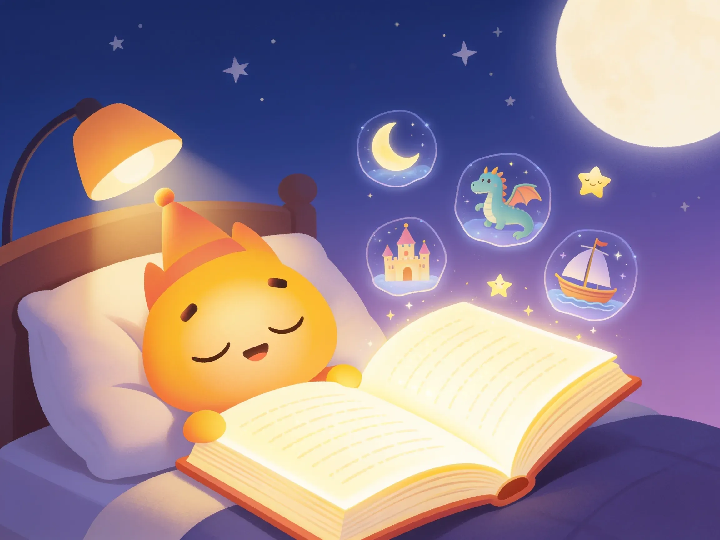
Why Illustration Style Sets the Mood
Style is more than decoration. It signals tone before a single word is read. Soft, hazy watercolors whisper "calm bedtime," while bright, chunky cartoons shout "let's play." The same story about a brave little fox can feel cozy, comic, or epic depending entirely on how it is drawn. Picking a style intentionally means your art and your words pull in the same direction.
A Tour of Popular Illustration Styles
Here are six styles that appear again and again on beloved bookshelves, and what each one does best.
Watercolor
Gentle, dreamy, and full of soft edges. Watercolor is a classic choice for quiet, emotional, or nature-themed stories. It excels at mood and atmosphere.
- Best for: bedtime books, gentle adventures, seasonal tales
Classic Storybook
Detailed, warm, and slightly nostalgic, this is the timeless "once upon a time" look. It rewards readers who linger on every page.
- Best for: fairy tales, family read-alouds, heirloom-style books
Bold Cartoon
High energy, big shapes, expressive faces, and punchy colors. Cartoon styles are playful and instantly readable for young eyes.
- Best for: comedy, action, books for toddlers and early readers
Paper-Cut and Collage
Textured layers that look handmade and tactile, as if you could touch each piece. This style feels crafty and imaginative.
- Best for: counting books, concept books, artsy or DIY-themed stories
Digital Painterly
Rich, cinematic, and full of depth and light. Painterly art brings a movie-like grandeur to fantasy and adventure.
- Best for: epic journeys, magical worlds, older picture-book readers
Minimalist
Clean shapes, plenty of white space, and a limited palette. Minimalism keeps the focus tight and feels modern and calm.
- Best for: concept books, mindfulness themes, design-forward gifts
Match the Style to Your Reader's Age
Age shapes what young readers respond to:
- Babies and toddlers (0-3): High contrast, simple shapes, friendly faces. Bold cartoon and minimalist styles work beautifully.
- Preschool (3-5): Warmth and playfulness. Watercolor, classic storybook, and cartoon all shine here.
- Early readers (5-8): More detail and richer scenes. Painterly and classic styles reward closer looking.
When in doubt, picture your reader holding the book. What would make them smile and want to turn the page?
Let Tone and Story Lead the Way
Before you commit, ask three quick questions:
- What is the feeling? Cozy and calm, or loud and silly?
- Where does it take place? A misty forest suits watercolor; a busy city suits bold cartoon.
- Who is the hero? A soft, huggable character and a daring action hero call for different lines and colors.
Let the answers point you toward a style that amplifies your words instead of competing with them.
Tips for Keeping Your Illustrations Consistent
Nothing breaks the spell faster than a character who changes from page to page. Consistency keeps readers grounded.
- Build a simple style guide: Note your color palette, line weight, and character details such as hair, clothing, and proportions.
- Keep characters on-model: The same eyes, the same outfit, and the same friendly smile throughout.
- Use a steady color palette: A shared set of colors ties every spread together.
- Match backgrounds to characters: Detailed characters need backgrounds that support them rather than overwhelm them.
- Review spreads side by side: Looking at pages together reveals drift you might miss one at a time.
Bringing It All Together
The right illustration style is the one that makes your story feel exactly the way you imagined it. Start with the feeling you want to create, consider your reader's age, and then choose the look that brings it to life, keeping everything consistent along the way.
If you would like to experiment before you commit, AnyTale lets you create and illustrate your book in multiple styles, from soft watercolor to bold cartoon, so you can watch your story come alive and pick the look that fits it best. Try a few, trust your instincts, and enjoy seeing your characters take shape.
Share this article